Friday, 23 July 2021

An unexpected Christmas Card

Today I have a very quick post to share a Christmas card I made after finding a background piece I made with alcohol inks a while back. I thought it would make a good background to a new poinsettia die I recently bought.


I inked a piece of bristol board with distress inks before die cutting and stacking 3 times, mounted it onto the AI background and stamped and heat embossed the sentiment, done!


The sentiment is actually heat embossed in poppy red, but it doesn't up on the green card, never mind. you can't really see in the picture but there is a bit of foiling on the background that gives a bit of shine. I also added some stickles to the flower centre.

I am sharing this at:
CAS Christmas - Poinsettia
A Place to Start - Your favourite holiday/celebration
Heart 2 heart Challenges - Christmas in July (no CTMH products used)
Double Trouble #89 - Christmas in July (Thing 1)
Addicted to Stamps & More - Die Cuts and or stencils


Supplies:
Cardstock: Bristol board; Adorable scorable coated card
Ink: Distress Inks; Versamark
Stamps: Uniko simply said
Dies: Creative Expressions CED3179

Thank you for taking the time to visit my blog today, I really appreciate it. 

Sunday, 18 July 2021

Blue Rose

Good morning, I have been away for a few days so haven't been around much. I shall try and catch up with things over the next few days, so hope to see you soon. Next weekend I shall be driving to collect my grandchildren and bringing them home to stay for a few days, so I am likely to be absent again for a while. I am really looking forward to seeing them properly as it has been so long, but I am concerned that my energy might run out! I have booked a beach hut so they can exhaust themselves on the beach, so I am hoping for fine weather.

Today is the 18th of the month so it is reminder day for  the current challenge at we love Chocolate Baroque, the theme this month is:

**Beautiful Blooms**

I have been really enjoying using my new stash of  Chocolate Baroque stamps and after using 4 different stamp sets on my last card you will be relieved to hear that today I have only used 1 so my supplies list is much shorter.


I started with an A6 piece of Bristol board and blended  2 colours of blue Distress Ink. Once I was happy with the blending I chose my stencil to enhance the background, laid it over the panel and sponged white pigment ink onto the panel. I really love the look you get from using white ink. After removing the stencil I went over the panel again with the DI until I was happy with the way it looked.


I stamped the rose with Versafine Clair twilight ink (I am definitely going to be buying more colours of this ink, it is quite amazing) and clear heat embossed it.


To enhance the rose I took a damp paintbrush and lifted colour from sections and added a little extra colour to the nooks and crannies of the rose. I cut the panel down and mounted it on a white card leaving just a small edge and mounted that onto a dark blue card base. 

When I first started making cards I very rarely added a sentiment to the front, but that changed over time now I very rarely don't add a sentiment. I decided that I really like this card and didn't want anything to detract from it. I hope you like it too.

You have until 30th of the month to join us over at we love Chocolate Baroque and although you don't have to use Chocolate Baroque stamps it would be lovely if you did. There is also a prize to be won. 


Supplies:
Cardstock: Bristol Board; Bringmann 300gsm photo mounting board
Ink: Distress ink salty ocean and blueprint sketch; white pigment ink
Stamps: CB Rose Duo
Stencil: Spellbinders Impressabilities Pebbles

Thank you for taking the time to visit my blog today, I really appreciate it. 

Thursday, 15 July 2021

CAS Mix Up Reminder

It's time for the reminder post for this months CAS Mix Up challenge. It is a mixed media challenge and our host is Coni, she has chosen alcohol ink on vellum as the prompt this month.  I do love using alcohol ink but don't get it out as often as I should, so I have enjoyed created my cards this month.

I have used alcohol pearl inks this time and played around on a pice of vellum until I was happy with it. I am lucky enough to have the outline die for this dahlia so I was able to avoid that horrible fussy cutting. The flower outline was cut from cream coloured card and stacked 3 times.


The panel was dry embossed on some off white paper and the sentiment stamped on the cream card. I used a stencil from the flower die to decorate the insert and the envelope.


You can see the shine from the pearl ink a little better on the close up picture.


Once the inking was done this was a very simple card to make. I think it is quite effective and am pretty pleased with it. I hope it might inspire you to take part in CAS Mix Up challenge this month. You have until the 24th to get your entries in.

I have used stamping, die cutting, alcohol inking and dry embossing for this card.


Supplies:
Cardstock: Cream linen effect 260 gsm; off white paper
Ink: Ranger alcohol pearl alchemy & splendor; Ranger alcohol currant
Stamps: My Favourite Things
Dies: Memory box (Flower); Concord & 9th (sentiment Strip)
Embossing folder: Darice

Thank you for taking the time to visit my blog today, I really appreciate it. 

Sunday, 4 July 2021

Meadow View

Today is the first Sunday in the month so time for a new challenge at We Love Chocolate Baroque. This month the theme is:
**Beautiful Blooms**

I do love flowers so this challenge is no hardship for me and of course I bought several CB flower stamps when I knew I would be joining the DT.


I got my idea for this card from the wonderful Heather Telford. I really liked how she did the background for the journal page you can see if you follow the link, so I started by smooshing some distress oxide ink on the bottom of my panel, then I used a blending brush to do the blue sky.

Once I was happy with the background I used CB Baroque meadow silhouette stamp which I lightly inked with a grey ink and stamped several times, moving it along a little each time. Then I inked the same stamp with watercolour markers and spritzed with water before stamping. This gave the loose splodges of colour in the 'meadow'. Then I took the silhouette leaf stamp from Rose Duo and repeat stamped it across the card in a dusky green. Finally I took the leaf/flower spray from the Lords & Ladies stamp set and stamped it in the foreground to the left of the panel. This is such a gorgeous stamp, it has amazing detail and a mix of open and silhouette images. I stamped it again several times across the card off the edge and added a little colour to the flowers. I used Catherine Pooler Spruce ink for the stamping as I didn't want a harsh black and it worked beautifully.


The sentiment comes from the Ace Card stamp set which I stamped and heat embossed on vellum. Here is a close up so you can see all the layers of stamping. I am quite pleased with how this one turned out. It has a summer meadow feel that I was aiming for - hooray. It is so nice to say that as mostly the end result is never what I intended!


I hope I might have inspired you to take part in this months challenge. 

I shall look forward to seeing you in the gallery

Supplies:
Cardstock: Adorable scorable mattastic; Bristol Board; Vellum
Ink: Distress ink; Distress Oxide; Catherine Pooler; Stabilo watercolour pens
Dies: A6 Stitched rectangle by Create a Smile

Thank you for taking the time to visit my blog today, I really appreciate it. 


Friday, 2 July 2021

June CCC Reveal

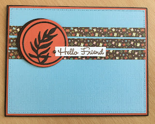
Today is the 2nd of July so time for the reveal post over at the Card Chain Challenge where you will see 24 cards that were sent around the world in June. My card didn't go that far this month as I sent it to Jo who lives in England too.  I think that this fact made me slow to get going on my card and I felt a bit delayed but then it only took 2 days to reach her so it didn't matter.


I used the sketch option and also matched the colours as best I could.


when I first made this card I used the pale blue for the circle die, but I didn't like it as the red that I used for the matting just overwhelmed it and it needed to be balanced, so I re-did it using the red. I did leave a hint of blue by stacking the die and leaving the inner leaf pieces in place. I was much happier then. I didn't have a suitable orange red card so I took a piece of orange card and used an alcohol marker to make it redder. I think it worked.


The stripes are made with washi tape and I was pleased that the sentiment heat embossed onto it OK, I wasn't sure that it would work. The tiny flower washi was a gift from the lovely Gundi at papierelle.


I received this amazing card from Linda in MN, the thing about this card that really made me love it is that Linda has used a die from the same set that I did. These little circle dies are part of a set of 6 from Pinkfresh Studios. What a great coincidence, or maybe not as they do fit beautifully with the sketch, but it is still something that we both happen to own the same set.


I have one last thing to share today. In May Tina in Slovenia sent me this card:


She enclosed with it an embossed panel and some flower die cuts that she used to make it. I have now made them into a card and I thought I would share it here:


What a gorgeous embossing folder it is. I used some metallic gilding wax to add colour and enhance the texture and then I coloured the flowers with alcohol markers. I added the leaves and arranged them on top of the sentiment strip. I finished it off with a few tiny gem flowers for the flower centres. I am quite pleased with it so I would like to know what you think.


Thanks Tina for the little gifts.


Supplies:
Cardstock: Adorable scorable coated card (blue), brown & orange 300gsm card
Stamps: Uniko, simply said
Dies: Pinkfresh Studios; Memory Box, pinpoint leaf plate

Thank you for taking the time to visit my blog today, I really appreciate it. 


Thursday, 1 July 2021

July CAS Mix Up

 Hello and welcome to the July CAS Mix Up challenge where the lovely Coni is our host. It is the turn of mixed media this month and Coni has chosen the theme of alcohol ink on vellum. It is ages since I had my alcohol ink out so I enjoyed creating my cards this month.

Our guest designer this month is the one and only Hannelie. We are honoured to have her join us this month as she is the queen of CAS and I just love her cards.


I started with a sheet of vellum and chose pink and blue as my colours and then just played about until I was happy with my panel. I actually did 2 layers of ink to add a bit more depth to the panel and finished by splattering some silver mixative over the panel. This gives a lovely shine that you can see on the close up picture below.


The vellum is wrapped around my white die cut panel and glued in place. The die cut leaf spray was stacked 3 times and a few of the central leaf bits left in place. The sentiment was stamped with Catherine Pooler ink. I used the die to create a stencil which I used to decorated the envelope and insert.


When I was planning what to put where on the card I had decided to use the vellum the other way round so the bold colour was under the die cut, but guess what? It somehow managed to end up the wrong way, hey ho... Perhaps I need to pay more attention to what I am doing!

I have used stamping, die cutting and alcohol ink on my project this month.


I am looking forward to seeing lots of lovely alcohol inked creations in the gallery this month, but don't forget to keep it CAS.
Supplies:
cardstock: White stamping card; adorable scorable coated card
Ink: Ranger alcohol ink in salmon pool & aquamarine; Catherine Pooler in it's a girl & something borrowed
Stamps: Uniko
Dies: Pink Fresh Studio leafy branch

Thank you for taking the time to visit my blog today, I really appreciate it.